 大量图片加载优化

# 图片加载存在的问题、原因及解决方案
# 启动页面时加载过多图片
# 问题分析
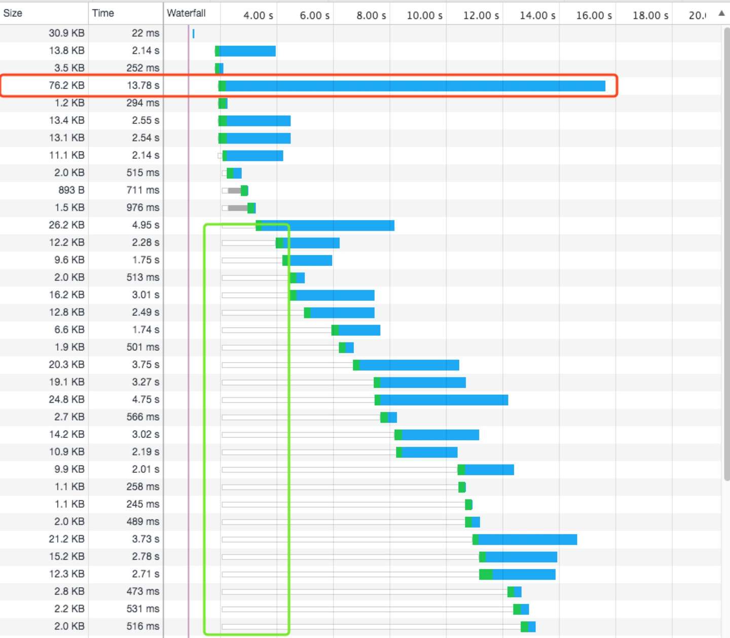
如图,页面启动时加载了大约 49 张图,而这些图片请求几乎是并发的,在 Chrome 中,对于同一个域名,最多支持 6 个请求的并发,其他的请求将会推入到队列中等待或停滞不前,直到六个请求之一完成后,队列中新的请求才会发出
# 解决方案
- 减少首次加载的请求次数,即只加载首屏内的图片,可以通过
getBoundingClientRect方法,获取图片的位置信息,判断其是否在viewport内部const inViewport = (el) => { const rect = el.getBoundingClientRect(); return ( rect.top > 0 && rect.left > 0 && rect.bottom < window.innerHeight && rect.right < window.innerWidth ); };1
2
3
4
5
6
7
8
9 - 如果元素没有插入到 DOM 树中并渲染,怎么能判断是否在首屏中?
<!-- defer 为true 优先请求加载 -->
<img v-img="{hash: 'xxx', defer: true}" />
1
2
2
const promises = []; // 用来存储优先加载的图片
Vue.directive("img", {
  // bind: 只调用一次,指令第一次绑定到元素是调用。在这里可以进行一次性的初始化设置
  bind(el, binding, vnode) {
    const { defer } = binding.value;
    if (!defer) {
      promises.push(update(el, binding, vnode));
    }
  },
  // inserted: 被绑定元素插入父节点时调用(仅保证父节点存在,但不一定已被插入文档中)
  inserted(elm, binding, vnode) {
    const { defer } = binding.value;
    if (!defer) return;
    if (inViewport(el)) {
      promises.push(update(el, binding, vnode));
    } else {
      Vue.nextTick(() => {
        Promise.all(promises)
          .then(() => {
            promises.length = 0;
            update(el, binding, vnode);
          })
          .catch(() => {});
      });
    }
  },
});
1
2
3
4
5
6
7
8
9
10
11
12
13
14
15
16
17
18
19
20
21
22
23
24
25
26
27
2
3
4
5
6
7
8
9
10
11
12
13
14
15
16
17
18
19
20
21
22
23
24
25
26
27
- 对于同域名只支持 6 个并发请求,可以进行域名切分,来提升并发的请求数量
- 使用 HTTP/2 协议
# 部分图片体积过大
# 问题分析
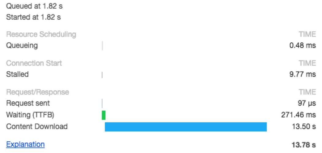
如图,该图片主要耗时在Content Download阶段,图片体积过大,直接导致下载图片时间过长
# 解决方案
减小图片大小
FileSize = Total Number Pixels * Bytes of Encode single Pixels- 一张
100px*100px像素的图片,就有100*100=10000个像素点,而每个像素点通过RGBA颜色值进行存储,R/G/B/A每个色道都有 0~255 个取值,即2^8=256。正好 8 位 1byte,即每个像素点 4bytes。因此该图片体积10000*4bytes=40000bytes=39KB
单位像素优化
- 有损的删除一些像素数据:减少每个色道的颜色值来减少单位像素的字节数
- 无损的图片像素压缩:通过算法将颜色值相近的像素压缩
- jpeg/png/gif/webp 合理使用
图片像素总数优化
- 使用 lib-flexible (opens new window) 来对不同的移动端进行适配。
lib-flexible在 HTML 元素添加了两个属性data-dpr和style
const resize = (size) => {
  let viewWidth
  const dpr = window.devicePixelRatio
  const html = document.documentElement
  const dataDpr = html.getAttribute('data-dpr')
  const ratio = dataDpr ? (dpr / dataDpr) : dpr

  try {
      viewWidth = +(html.getAttribute('style').match(/(\d+)/) || [])[1]
  } catch(e) {
      const w = html.offsetWidth
      if (w / dpr > 540) {
          viewWidth = 540 \* dpr / 10
      } else {
          viewWidth = w / 10
      }
  }

  viewWidth = viewWidth \* ratio

  if (Number(viewWidth) >= 0 && typeof viewWidth === 'number') {
      return (size \* viewWidth) / 75 // 75 is the 1/10 iphone6 deivce width pixel
  } else {
      return size
  }
}
1
2
3
4
5
6
7
8
9
10
11
12
13
14
15
16
17
18
19
20
21
22
23
24
25
26- 使用 lib-flexible (opens new window) 来对不同的移动端进行适配。
上次更新: 2021/04/22, 13:38:59